Here is the final animation (for now, I plan to expand on it and possibly colour it in the future). My notes and crit will be in my next post, as I need a break after shooting and editing 120+ frames (386 in total for the whole thing at 24fps).

Would love some feedback on this!
Basic things I have learned that need to be implemented when shooting the animations:

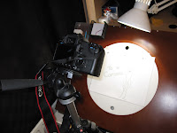
  • Curtains shut - Natural light changes too much so all light must be artificial and controllable to avoid inconsistencies
  • Tripod fixed - To avoid any movement between frames.
  • Rotation of acrylic disk stopped - To avoid any movement between frames.
  • Replace frames, don't stack - avoid onion-skinning effect of previous frame visible underneath.
  • Shooting with a DSLR, not Mini DV -  I am finding it much easier to shoot with a stills camera that using a miniDV hooked up and streaming to iStopmotion. I miss out on the overlay effect to help line up shots, but this is unnecessary anyway if care is taken making sure the setup is secure.
  • Increase the Exposure - Avoids too many shadows showing on the paper and produced a much more black and white image, which makes it easier when editing.
When creating all of my other animations, the beginnings and ends were not so noticeable as they were so short, however for my 10-20 second one I feel a brief title screen and end screen would round it off nicely and make the audience more aware of the stucture of the piece.

However, I did not want these to be static screens that would look out of place and 'frozen' so for each one I did several identical frames, hand drawn. The small inconsistencies between these frames made each still image look 'alive' when looped and animated, and much more in keeping with the animation.

It is these small shaky inconsistencies throughout the animation that give it its hand-drawn look and to my eyes, adds to its appeal. I think of it as the same way the fingerprints on Wallace and Gromit make it so special and unique, and the same squiggly lines in The Cat Came Back (see below) that could have easily have been removed or smoothed out, but were left in, and really make them more personal and unique.

A still from The Potato Hunter, this was a great reference for the over-the-head swing with the mallet, as well as watching someone chop wood with an axe, as all these movements are very similar.

First of all, apologies for the video qualities, for test pieces I am using very small file sizes so they don't take too long to upload, but when the final piece is up I'll use less compression!

Quick test to help me figure out timing and spacing for another anticipation piece.


Another test now inked and a bit more visible, with first part of the timing and spacing worked out fine, but need to add a few frames into the second half (the strike).


And now the almost-final piece, with just a few frames left to add, and I may try to colour it if I get time!
The use of sound in animation and film has always played a vital role, and moreso in films of little dialogue, such as Wall-E to help convey emotion, stage a scene and tell the story. Ben Burtt is considered the father of modern sound design, having first started work on such films as the original Star Wars, and more recently, Wall-E. Whereas Disney had always used instruments for sound effects in its animations, such as a cymbal crash for a collision, Burtt starting improvising and creating his own "instruments" out of whatever made the most believable sounds, from slinky springs to pieces of fruit. This is because, as with the drawn designs and movements in animation,

Believability is more Important than Realism

That is to say, that the emotion a sound evokes, if the correct emotion, is more important than if it is the correct physical sound being produced. For example, is a spring being struck sounds like a lazer being fired, then that it what should be used rather than the realism of a lazer being silent. This is because the Kercheeww or Zzzap feels more emotionally right for something we are unfamiliar with, and is then replaced in our minds that this is what these things should sound like.


Modern techniques for voice manipulation, control instruments and digital synthesizers have widened the field of sounds that can be produced but are no good unless used in the right settings, again all about believability.

I think care must be taken with sound, as people can easily pick up on sounds that are out of place or just "not right", especially in films that are more based around physical expression than dialogue.


This test is just for the launch of the rocket, and looks good I feel although, a little fast. The smoke is believable and the takeoff is exactly how I wanted it to look: a squat down as if pushing the flames and smoke out, then an explosive thrust upwards as it pushes fully and stretches as it races off into the sky.

Principals of animation being used in my Animation so far:
  1. Squash and Stretch - In the movement and jumping of Rocketman as well as the takeoff of the rocket.
  2. Anticipation - In the movement jumps and takeoff of the rocket.
  3. Slow in and Slow out - On the zooming of the view and rocket takeoff.
  4. Exaggeration - Rocketman's expressions and rocketship takeoff.
  5. Solid Drawing - making the character look and feel solid and keeping the art style the same throughout.
  6. Appeal - At a minimum as the character is relatively simple, but I have tried to make it more 'likable' using expressive gestures.
  7. Arcs - In Rocketman's movement and jump.
  8. Timing - Throughout the animation.
  9. Secondary Action - The purposeful jog into the cockpit, the billowing steam before takeoff.
  10. Straight Ahead and Pose-to-Pose - I used a mixture of the two throughout the animation, pose to pose for the complex movements and straight ahead for more loose parts such as the billowing smoke.
  11. Follow Through and Overlapping Action - Smoke dissipating in a trail after the rocket, the swing of the arms as he lands in his chair.
  12. Staging - Minimal as the whole animation is seen from one view, but tried to make use of it with expressive gestures and the positioning of the different subjects throughout.
Following these principals through the pipeline of production on this piece of work has helped me keep the animation together as a whole, and make sure it looks a good solid piece with minimal inconsistencies.


Another test piece with a lot more of it inked and ready, but with still a few tweaks to make like the hang time during the bell shock and his landing from it, but want to get the bulk of the animation done before fixing nitty gritty bits as its on a tight timescale.


Here is the next pencil test for my Rocketman short, this segment is mostly the introduction as it merges from the title screen into a more 2d-profile view which will be more consistent to the rest of the animation.
From there, Rocketman is alerted by a wall bell, which surprises him and launches him off into his march/run to the cockpit.

Changes to make:
  • stop the lengthening and shrinking of him during the roll up to the horizon
  • more hang time for the bell ringing shock
  • more frames for the jump up and landing for the bell shock to make it more obvious how he is jumping.

Feedback welcome.
Throughout these early animations, I have taken inspiration from some stop-motion shorts by Timothy Hittle, Canhead and The Potato Hunter. Hittle was a computer animator at Pixar studios for a while before working on such films as MonkeyBone. The main character in these shorts is Jay Clay, and his mostly-human proportions yet lack of any real detail on his surface I really found inspiring. The extremely expressive emotions portrayed via body language was close enough to actual human movements, yet with a flair of cartoonish exaggeration to merge the two types of animation.

When creating a character for my small animations I used a similar character as I wanted to portray emotions and feelings without using facial expressions and do it mostly through body language to practice working with expressive gestures and silhouettes.

Another similar character is Morph, a figure I grew up watching from when I was young, and obviously left a lasting impression on me! The expressiveness about these mostly human but cartoonily simple forms really appeals to me.


Hittle's short film Canhead shows a great range of emotions from rage to fear and bravery and definately worth a watch:

Canhead

Written and created by Georges Méliès, this 1902 short film used a combination of camera trickery and studio effects to create one of the first science fiction films, with effects that wowed audiences. Georges Méliès took much inspiration from The Theatre Robert-Houdin and his life as a magician and trickster to create the film. Some of the effects used were to stop filming and change items, then continue filming to give the effect of morphing/disappearing/appearing subjects, splicing and editing the film after the shooting, as well as rolling backgrounds (to give the illusion of falling/flying), and many other techniques.

Méliès had been wowed in 1895 when he first saw a film of workers leaving a factory moving for the first time, and he obviously saw a lot of potentional in this new medium for combining this with his knowledge of working in the theatre and its stage effects.

In December 1929 A Gala was held in Méliès honour, and still now he is considered a pioneer of animation and filming techniques.
Here is my first attempt at colouring in an animation properly, all done frame by frame on photoshop, and didn't turn out too badly I feel, but still deciding if it was really worth it, as I really like simple black and white ones.

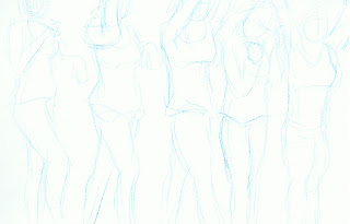
From this week's life drawing class, the images in order are; a longer 1/2 hour drawing of a held pose, a constantly moving model with a 5 minute drawing time, a held pose for 5 minutes, drawn with the left hand. We did some blind drawing too, which consisted of not looking at the paper whilst drawing the model, however these did all look pretty similar to one another and I didn't feel like I had learnt as much from those as perhaps some of the other techniques we have used.


The left-handed drawing was probably my favourite out of this session, which I suprised myself with, and again the longer drawing time piece, which I could take more time over turned out well, even if the head is a little out of proportion.

Feedback welcome!
After watching a documentary called "From Pencils to Pixels" which described the birth of animation through to today's furthestmost cgi creations, mainly focussing on Disney and Pixar, I felt I had learnt a lot about the path animation has taken to get where it is today, but also that there is so much out there that I have not seen.


From Gertie the Dinosaur and Little Nemo in the very early days of animation, through to the rise of Disney, techniques in which animations are produced have staeyd realtively the same, while at the same time progressing from small one person productions to 600+ working on classics such as Snow White. Disney was the main instigator of this more industrial production of its animations, however some studios still let one or two main people be the driving force behind them (Ghibli).


"Animators are Actors with Pencils"


Pixar has introduced a whole new medium of popular animation, that breathes new life into frame-by-frame animation and is astounding audiences worldwide. John Lasseter, the head of Pixar, started with early short films such as The Adventures of André & Wally B and Tin Toy. They first hit the big-time however with the 1995 release of Toy Story, which proved to audiences that computer animated films could provide a level of depth and quality of storytelling that was previously assumed that they could not. Since then, they have had quality hit after another, most recently UP, which is a beautiful and well-told story.


The Death of 2D Animation?
One of the points raised from the group after watching this documentary was that "is 2D traditional animation dead or dying?"
I really do not think there will ever be a time when there will be no demand for traditional drawn animation, as much the same way that once digital painting was invented, people didn't give up on more traditional mediums of paint and pencil. It is simply a different process and produces its own unique results, and will be popular for as long as it is unique.
Another test for "Rocketman" just trying out a small title page before the short starts, there is still a lot of missing stuff here; its only about 20% there I'd say!


I'm still not sure how I prefer to digitise the animations, using a mini DV camcorder and iStopmotion to use the live streaming effect to make sure everything is lined up and be able to test as it is being compiled, or to use a DSLR to take the photos which allows for greater creative settings plus on the spot adjustment of contrast for nice white backgrounds and sharp dark lines.

Any thoughts and opinions on how anyone else does it would be great!
For this weeks mini-project the principal we were tasked to show was anticipation.
This short animation shows a crouch (with a brief pause to emphasise it) with the stretch up and leap to roll and grabbing the rabbit. I feel it looks good (despite forgetting to turn off the auto-focus on the camera so excuse the flickering), and moves well but could have emphasised the pause and actual anticipation part a bit more, which I may just add some frames in to do.

From my last post you can see how today was spent doing a lot of quick life drawing, and after thinking about what I had produced I found myself reaslising I felt I had only learnt something from these exercises when they were the one-minute poses or longer. The poses the models held for only 10-30 seconds simply made me feel too rushed and unconcerned with the structure of the drawings that I did not take anything away form doing them.
Longer than a minute or so and I felt it was just long enough to accomplish a proper structure and analyse what it was that was wrong /right with the sketches and learn from my mistakes. I feel today taught me a valuable lesson in choosing models and situations when life drawing!
Just a few bits from some of todays work, quick life drawing studies from 5mins to 10seconds per drawing to encourage economy of line and to plan our drawings (line of action etc)


Expressing character and posture through minimal use of lines.


Expressing movement in a frame-like way with a series of quick sketches or a moving model.


Mixed models posing for different frames of the same jump sequence.


Feedback welcomed please!
Further testing of part of my "Rocketman" animation, pretty pleased with the run cycle now I think, especially pleased with the leap and landing on the chair which looks very natural(ish).
Note: Inking is laborious but allows further changes to be made on the spot.

Today we had a group crit of our bouncing ball animations, and unfortunately my main one wouldn't load as the imac in the room couldn't cope with it as I had kept it quite large to be able to re-size it properly. Anyhow, I had to use the coloured version which was acceptable I suppose, but wasn't quite as nice looking as the original.

Things to learn from this crit:
  • Use a model reference to keep the subjects to scale.
  • Ink the sheets before digitising, otherwise, no matter how good the lighting, it just wont be clear enough on a small to medium sized video.

Anyway, after that session I showed some of the work in progress from my 20 second short to some of the group for advice. It consisted of a walk/run cycle and a small leap by a simple figure. The feedback I gained from this session was invaluable and has really helped me see it from other perspectives and improve the piece as a whole, which I am in the process of inking up at the moment.

Right, back to inking it up!
Just a quick test of a run/jog cycle I hope to use for my 20 second short "Rocketman", I feel it looks a little stiff, but actually better than I expected that it would. I think with a little tweaking when I ink it up it could be just right.


Just some snippits from still life doodles in my sketchbook and from life drawing classes. Feedback always appreciated.


So finally getting my workspace sorted out...

The lighting problem is mostly sorted now and seems fairly consistent.

I decided to add a different ball to the animation to experiment with working with the visible weight of objects. I feel it went well, but due to the fact it isn't as elastic as the animation is over fairly quickly for it. I had it roll down a hole (its own shadow) to shorten the time creating it (so I didn't have to draw it into every following frame as it is just a test piece).


Also for one version I tried colouring in the balls to see how that would look.

Just a few examples of my first still lifes in my still life sketchbook, any feedback welcome!


Its looks little smoother, however the lighting for taking the pictures is still a bit too inconsistent. Will look into this...

Any feedback welcome as always!


Quick test to see how the ball bounce animation is going along.

Also, It is incredibly nice to be working on proper animation paper at last, even though I seem to be getting through it at an alarming rate, and don't get anymore delivered until Wednesday. I still need to correct how I am lighting the paper when taking the pictures to compile.

Anyway, back to the bouncy ball test; this one was just to get a feel for using timing and spacing to plan out a scene, and I can already tell its making a massive difference and really helping. The ball looks good so far with a nice flow to the movement of it. Might change/add a couple of frames here and there, depending on current supplies of paper.


Here is the final little animation for expressing and exaggerating emotion in a face, I had to slow it down to 8fps as it was whizzing past a little to fast to notice all the transitions otherwise. I'm fairly pleased with it although some parts seem a little jumpy, but hopefully when I move onto proper animation paper rather than this flipbook paper I'm currently using, that should help smooth things out.


Just a quick test to try out some frames I did to make a head spin but it's jumping all over the place, I think next time I should not do the photographing of the frames without checking the tripod's stability first!
These are just a few of the sketches from my RVJ exploring the exaggeration of facial poses during expression-making emotions and searching for a base character face for the next animation. They were purposely kept simple, taking into account economy of line as well as being able to express themselves fully.

I chose myself as the main character, for no other reason that I think I can get away with making myself look stupid without facing anyone's wrath.


Just another little flipbook animation that I was using to get some more practice at them. Trying to make the figure walk/run convincingly was the trickiest part and I feel a lot more practice will be needed on that to get it right.